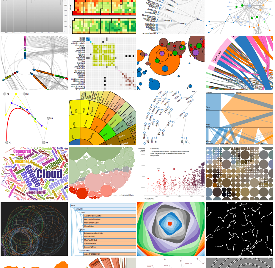
Anatomy of a data visualisation.
Premasagar Rose, Dharmafly
@premasagar
these slides: anatomydataviz.dharmafly.com
← arrow keys →
Premasagar Rose, Dharmafly
@premasagar
these slides: anatomydataviz.dharmafly.com
← arrow keys →

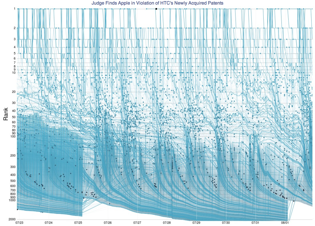
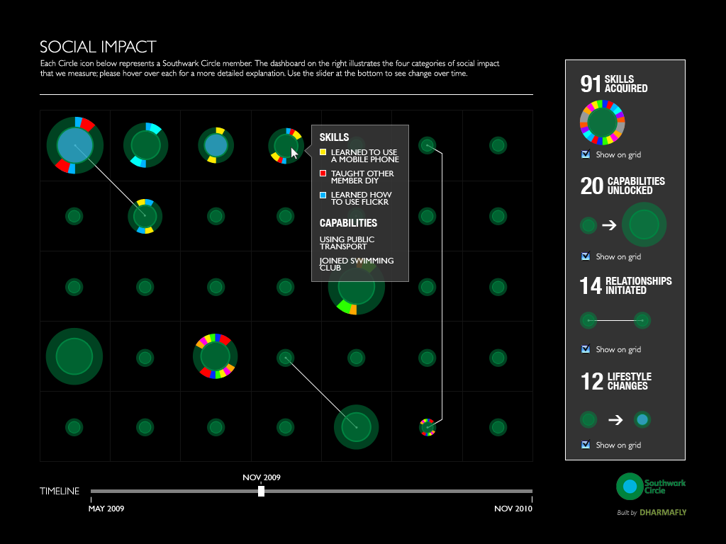
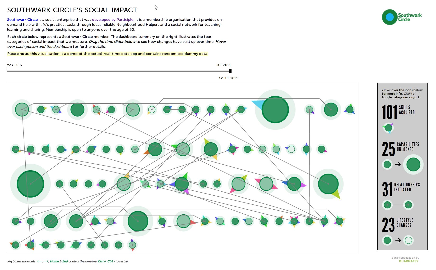
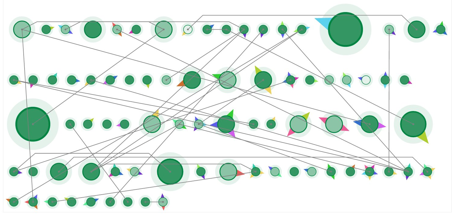
show Southwark Circle's social impact
support, sharing, teaching
and learning for older people
improve the "Third Age" of life
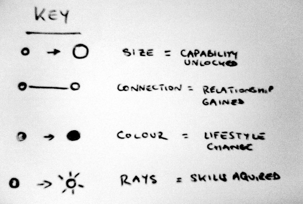
personal social impact events,
by category, person and locations
show Southwark Circle's social impact
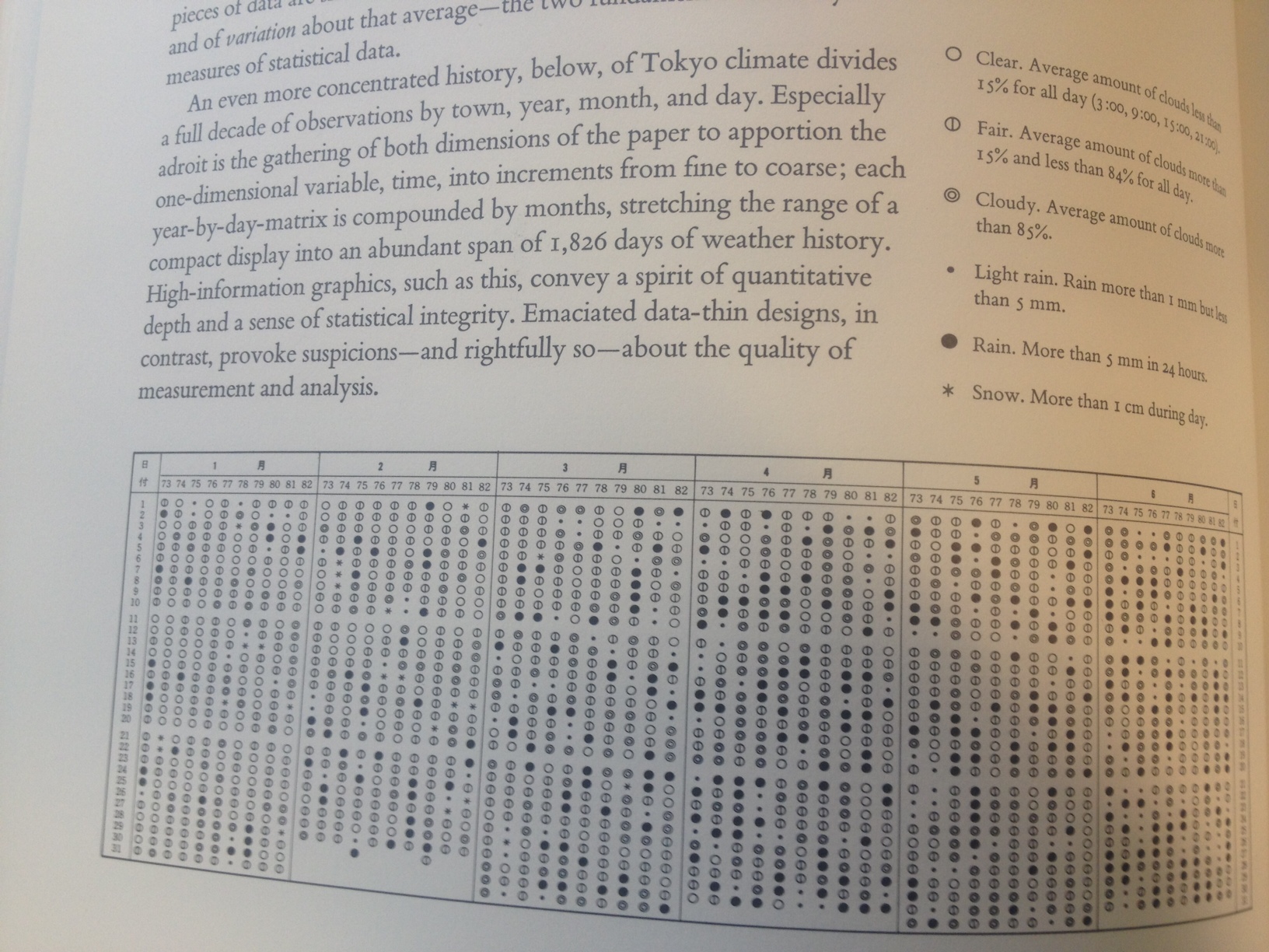

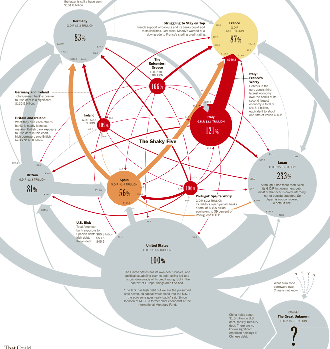
High-information graphics... convey a spirit of quantitive depth and a sense of statistical integrity
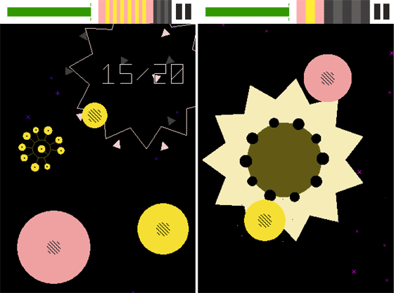

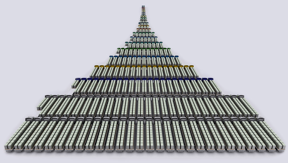
busyness = good
too gamey?
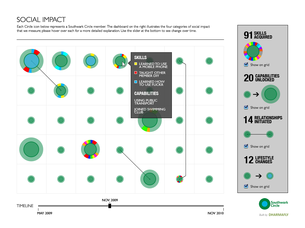
poker chips?

skillful


draws vectors in SVG with JavaScript
var paper = Raphael(
    htmlContainer, // DOM node or id
    300, // width
    300 // height
);
var circle = paper.circle(150, 150, 100); // x, y, radius

circle.attr({
  'fill': 'orange',
  'stroke': 'blue',
  'stroke-width': 10
});
paper.path('M50,150 L150,250 L250,50') // Move to, line to...
  .attr({
    stroke: 'green',
    'stroke-width': 10
  });
paper.path('M50,150 L150,250 L250,50 z') // 'z' = close the path
  .attr('fill', 'blue');
circle.click(function(){
  circle.animate(
    {cx:10, cy:290, r:5}, // attr to animate (x, y, radius)
    600,                  // animation time
    'bounce'              // easing algorithm
  );
});
and much more...

3 free events in summer 2012 for designers, journalists & programmers.
At Dharmafly's Lab for the Recently Possible, Brighton & Hove, UK.
these slides: anatomydataviz.dharmafly.com